Inkstand by Kakimori plus Custom ink mini review!

Inkstand 1.jpg

Inkstand by Kakimori is a store that is situated right next to Kakimori in the Taito district in Tokyo. Kakimori specializes in offering customised notebook binding offerings in their main store and next door, Inkstand is their customized ink offering store where customers are allowed to mix their own colours and have them produced in larger volumes for purchase by the staff there once they are happy with the colours.

To get started, first you need to book – either on their website in Japanese or via email in English. Once confirmed, they will send you out a little flyer which explains a little bit about the inks themselves.

inkstand_information

When we arrived, the lovely staff very quickly explained the process and left us to it. Essentially, there are a number of inks which with you can mix colours, use a maximum of 3 colours and keep track of the drops that you have mixed. Clean your stirrer and pen in between and that’s pretty much it.

Inkstand 2.JPG

There is a 1:1 colour chart included at each workstation and some example colours with ratios to give you some guidance on colours mixed as well. I didn’t take too many photos during the process because I jumped straight into the process.

Once you are happy with your colour, the team at Inkstand will confirm the ratios with you before getting started on the production process which took about 40-45 minutes.

Inkstand 3.jpg

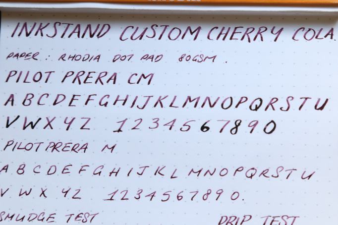
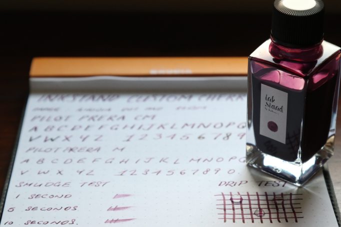
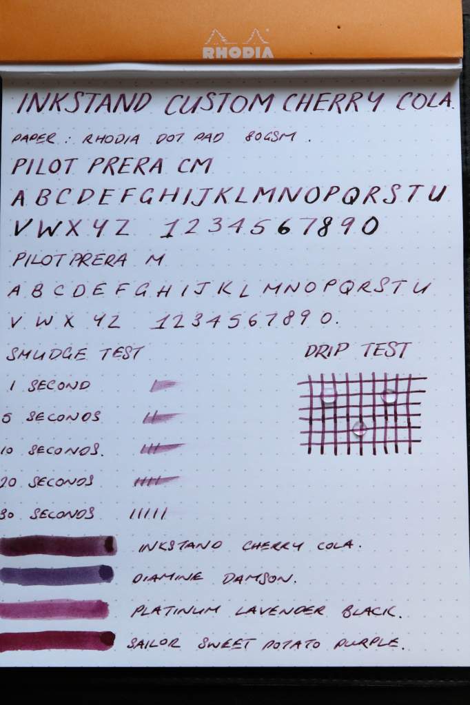
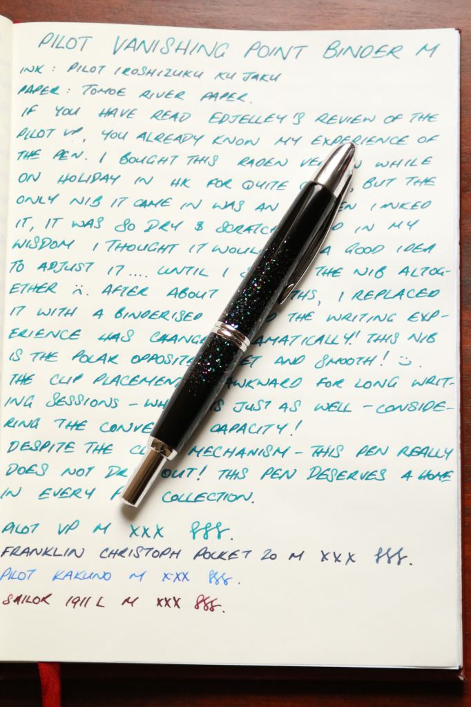
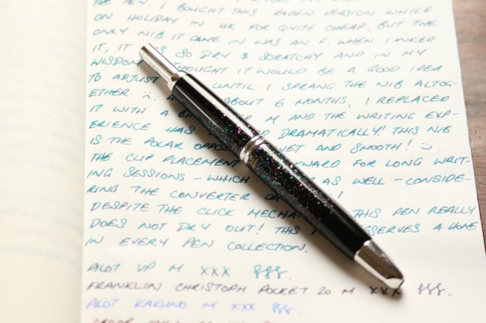
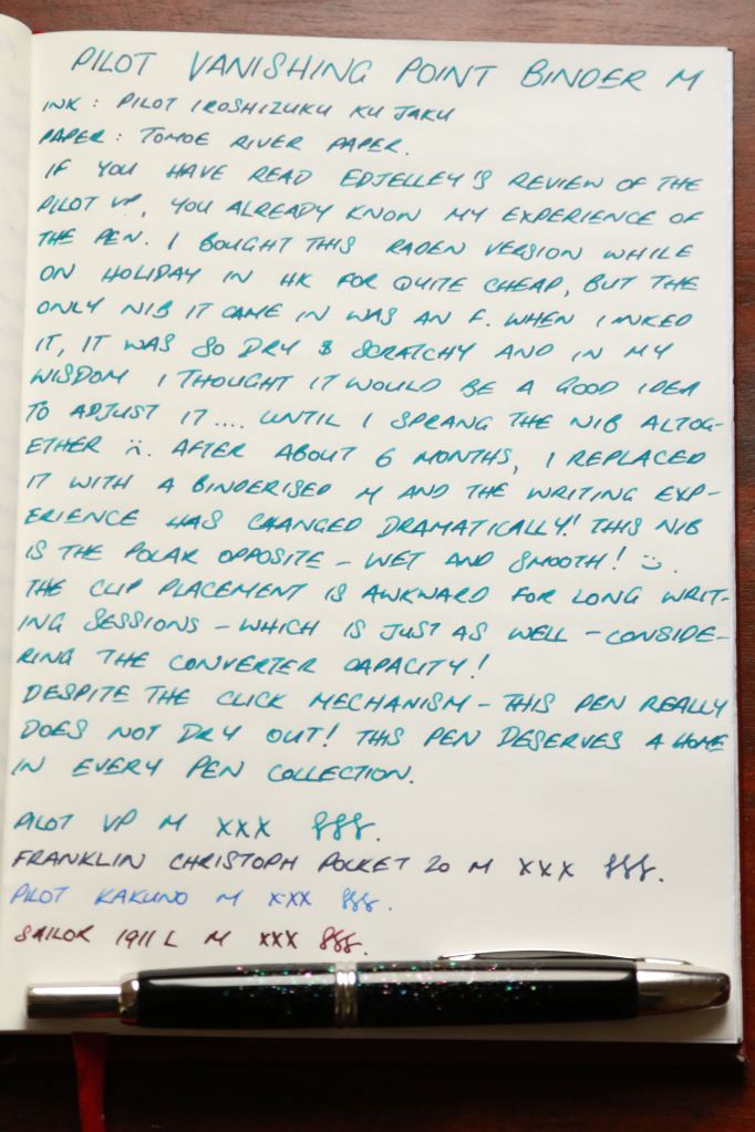
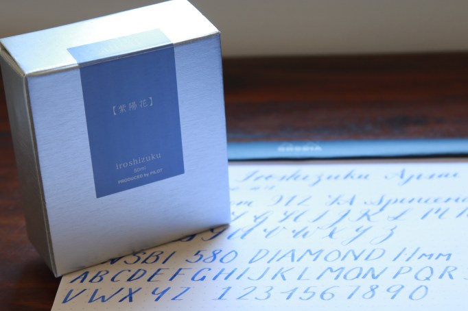
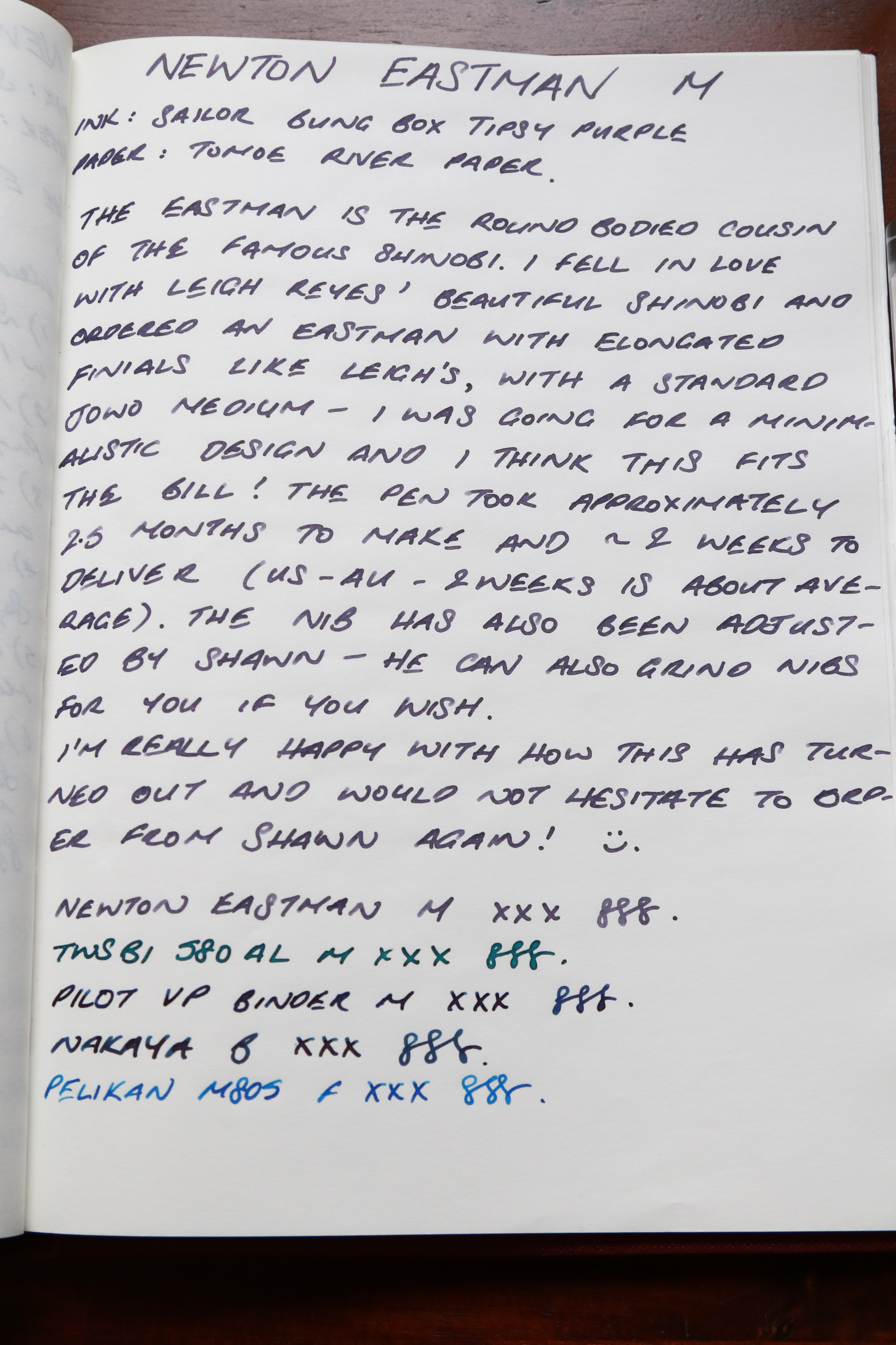
The colour I’m mini-reviewing we have nicknamed “Cherry Cola” in our house and was a colour my husband mixed up for me, knowing that I’m into my purples at the moment. Why a mini-review? Because the disclaimer Inkstand sent out about pigment inks made me too scared to use this ink in my more expensive fountain pens and I wanted to use them in pens that could be completely disassembled and cleaned in the sonicator if needed.

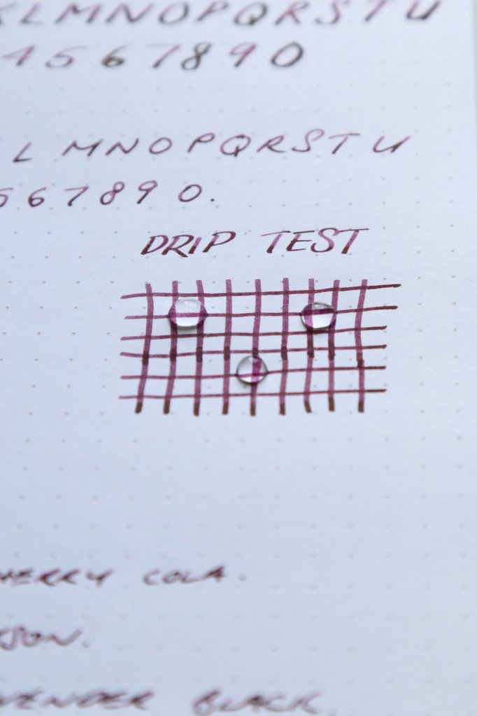
The ink seems to be pretty water fast – I left drips of water on the page for about 10-15 minutes and the ink did not streak at all during this time.

Inkstand 4.jpg

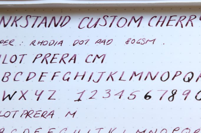
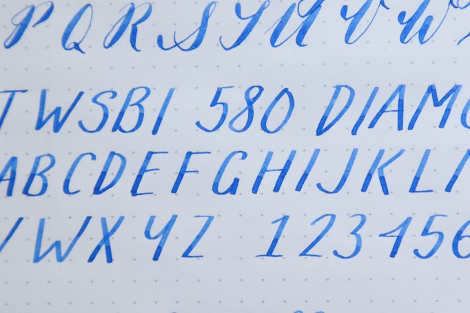
Shading wise, there’s a little bit of shading on the ink but not too much as the colour is reasonably saturated. Its worth noting that the ink “blobbed” out in the upstroke on the “6” in the following photo, but that seems to have only happened in the CM nib – I didn’t have any issues with it in the normal Medium nib,

Inkstand 5.jpg

From a colour point of view, its pretty unique in my collection – I’ve been ramping up my purple inks lately but I have nothing that comes close to this colour. I wonder if KWZ Brown pink would be similar however?

Inkstand 6.jpg

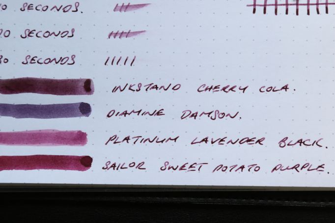
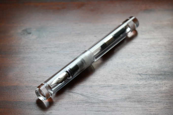
Given how colour fast the ink is from the drip test, I’m not likely to be inking this in my Nakayas anytime soon, but will make good use of them in my Pilot Metropolitans.

Inkstand 7

The ink cost about AUD$30 a bottle for 33 ml. The process was pretty fun and a unique experience, but this would not be the most cost effective way to ink up your pen. Some additional tips for the process would be – the diluting fluid is separate and the team can’t incorporate this into your mixture so leave it out; also make sure your drops are reasonably consistent sizes otherwise your ratios will be off.

Umeda Souq

Umeda Souq is a market place type section in the Umeda Hankyu department store, which includes the department store’s stationery department.

I was lucky enough to be offered 5% off the store’s products when I visited, as well as a tax refund for being an overseas shopper.

Sorry for the hiatus!

Sorry for the long hiatus between posts! I have been on holiday and had intended to post something before I left but didn’t get a chance to.

However, my holiday was to stationery heaven – Japan! So to give me a buffer before I get back into proper blogging mode, I thought I would share some photos from various pen and stationery stores that I visited while on holiday.

So to get started, here’s Loft Kyoto! Loft is a department store which has a huge stationery department. In Kyoto, it occupied a full floor. It offers general stationery and basic fountain pen and ink offering (think Iroshizuku, Sailor lines).

After I run out of Japan store photos, normal broadcasting will resume.

Kokuyo Power Racchikisu Stapler

Kokuyo Stapler 1

My love for stationery is not limited to just pens or paper. It’s a broad all encompassing passion, including all desk accessories, from analog paper related tools to technological gadgets.

Included in this is the humble stapler. I had an el cheapo which I acquired in university many years ago and I’ve taken it everywhere (to every job that is) since. When I initially started my current job, I used this stapler, but in day to day work (which included stapling a lot of paperwork everyday, and often thick documents), this stapler was a bit too heavy and stiff to use so often, that I had to look for an alternative. The ideal solution was an electric stapler but they were costly and the staples were also expensive, so I went with the Paperpro 1110 Stapler. This promised to staple up to 25 pages with the touch of a finger. And it sort of did, except that it also scared the bejesus out of the admin assistants that had to use it. With its semi automatic action, it acted like more of a staple gun, as opposed to a stapler.

Untitled.png

Paperpro 1110 – photo from Officeworks

The stapler was also enormous and you had to leave it out on your desk because it wouldn’t fit into your desk drawers. I am desk OCD and I don’t like to leave things out on my desk as it makes me feel cluttered and messy and I can’t concentrate as a result. So this massive stapler was not the ideal solution.

So once again, awesome Japanese stationery came to the rescue!

Kokuyo Stapler 2

Kokuyo Stapler 3

Left: Kokuyo Power Racchikisu Stapler, Right: PaperPro 1110

I found the Kokuyo Power Racchikisu stapler on Rakuten, which promised to staple up to 28 pages with very little effort. To do this, it uses some sort of ratcheting system which helps you staple such a large volume of pages without much effort. It is not “one touch” like the Paperpro, but it doesn’t take more effort than stapling a normal amount of paper with a basic, standard stapler. The stapling system is easy to use, without being a semi-automatic stapling maniac that scares half the office off.

Kokuyo Stapler 4.JPG

28 pages of A4, 80gsm Staples paper. This is solidly stapled with no risk of pages falling out of the staple

It also does not cinch the back of the staples (to create a rounded finish), which is good if you are doing a lot of documents which you need to stack afterwards so that all the documents lie flat.

IMG_1585.JPG

Unlike some other high page volume staplers, the Kokuyo Power Racchikisu uses standard staples – No.10 which can be found anywhere – even in Australia. This makes it even more attractive as you’re not limited to staples you need to order online only.

A number of the reviews I’ve found have been unimpressed with price of the stapler and doing a quick search of Amazon, I can sort of see why. However, in Australia, given that the cheapest, most basic, rubbish stapler can cost around $10, the Kokuyo is worth even the mark up American websites charge. The Paperpro cost me upwards of AUD$50. If you are interested in this stapler, get it straight from Japan, mine cost JPY560 plus shipping (a big package cost me JPY1160 to ship to Australia).

Kokuyo Stapler 6.JPG

Pilot Vanishing Point – Raden finish

1-pilot-vp-raden-6

I first saw this pen on the Goulet Pens banner and then this specific Raden finish on the Gourmet Pens blog. I have to admit, I thought it was absolutely hideous. My mind hasn’t changed too much on this front, this is not the most aesthetically pleasing (to me) pen that is available.

However, upon reading review after review touting the pen’s virtues, I started getting brainwashed thinking that it was more of a practical v’s beautiful pen and when I saw the Raden finish version in City Super’s Log On store in Hong Kong, which was super cheap to begin with and even better priced with the exchange rate back then, I took a leap and purchased the pen.

1-pilot-vp-raden-1

At the time of purchase, it was one of my most expensive fountain pens and I was pretty excited to try it out. I inked it as soon as I got back to the hotel room with the cartridge that came with the pen and tried it out. It was awful! The fine nib was dry and scratchy and it was a terrible experience. I reasoned at the time that it must have been the ink obviously and the paper was your standard hotel room notepad which was also obviously the issue, so I didn’t think much of it at the time and flew home with my purchase.

When I came back home, I inked it with Iroshizuku Ku Jaku and tried it on Rhodia paper and it was still absolutely awful. Now I knew that it was unlikely to be either ink or paper as I had used both successfully many times before. I knew it must have been the nib.

1-pilot-vp-raden-4

I tried adjusting the nib to make it wetter by “gently” bending the tines upwards to get more ink flow but I got a bit fed up with how long this process took and became less and less gentle on the tines until, genius that I am, I sprang the nib. My options now were either to get the nib fixed by a nib meister or purchase a new nib altogether. I noticed that Ed Jelley had the same issues that I experienced when he bought his Vanishing Point and opted to follow his suit, which was to buy a replacement nib from Richard Binder in medium.

Once the replacement nib arrived, I inked it with Iroshizuku Shin Kai and tried it on Rhodia again. Oh my! The experience was completely opposite to my first try – the nib was wet and smooth and it wrote perfectly! I could now fully understand why everyone raved about this pen, despite its less than appealing looks (to me).

1-pilot-vp-raden-3

Over long writing sessions, the placement of the clip does bother me because I don’t hold my pen in the “proper” pen grip, so I really only use this pen for quick notes and meetings. The push button mechanism really is very useful for these situations as well, as having to unscrew and screw pen caps in meetings, multiple times can be incredibly irritating as well, so the pen serves a purpose.

1-pilot-vp-raden-2

From an inking point of view, because the pen has a retractable nib, the part of the nib which sucks in the ink when you refill using a converter is much higher up than a standard fountain pen, so if you fill from an ink bottle, you will need a higher level of ink in your bottle to successfully fill this pen. Otherwise, you can always use a cartridge. If you do want to use a cartridge, make sure you don’t lose your little cartridge cap, which prevents the plastic cartridge from being damaged by the push button mechanism of the pen.

I ended up liking the nib so much that I purchased a matte black version for my husband, to try and convert him to the dark side (of fountain pens), but unfortunately, he was not keen. O no. I will just have to keep it for myself.

1-pilot-vp-raden-5

View of the Raden sparkles

Note: Sadly, Richard Binder no longer offers a full range of nibs to purchase.

Pilot Iroshizuku Ajisai

1-iroshizuku-ajisai-1

If I could only use one brand of ink for the rest of my life, it would very likely be Pilot Iroshizuku. I know I only posted my favourite inks of 2016 a little while ago and Sailor outnumbered Iroshizuku two to one but I still stand by that comment.

Iroshizuku is the luxury, high end line of inks made by Pilot. There are 24 inks in the line, although I have recently heard that there are 3 additional limited editions available exclusively in Tokyo. In my experience of Iroshizuku inks, they are all wet writers, well behaved (even on Moleskine for some of the inks!), and all easy to clean – which as you know, is an important ink quality for me.

1-iroshizuku-ajisai-2

Ajisai is a mid-hydrangea blue, and is more purple toned than other mid-blue Iroshizuku inks like Tsuyu Kusa and Kon Peki. In wet nibs, it dries more blue compared with drier nibs which show up more purple. I really like the way it looks in that stub nib and the Falcon nib in the writing sample below. It looks like it is more cornflower mid blue and more subdued than the Goulet Swab Shop sample below.

1-iroshizuku-ajisai-3

For shading enthusiasts, shading is present but not overt. Keep in mind that it is not that saturated so the colour difference is not as great, but for a mid-blue, it is pretty reasonable. To my eye, it looks more obvious in the stub than the flexible nib.

1-iroshizuku-ajisai-4

(Sorry my lines are a bit wobbly)

The closest ink I have in colour to Ajisai is Sailor Nioi Sumire. Noodler’s Periwinkle is sort of similar, but it looks like it has been soaked into the paper and doesn’t seem as vibrant as Ajisai or Nioi Sumire. Looking at the awesome Goulet Pens Swab shop, Sheaffer Blue also looks very similar to Ajisai and is much easier (and cheaper) to obtain.

Swab.jpg

Swab Shop Image – courtesy Goulet Pen Company

I’ve actually not used this ink very much since I purchased it – I’ve always felt a bit self-conscious using it at work feeling that being so bright and purple/violet toned, it was not work appropriate. However, I’ve started being a bit braver when it comes to using different colours at work and as I review this ink, I’m beginning to like it more and more. After using colours like Amethyst, Dark Lilac, Sweet Potato Purple and Tears of a Clown at work in 2016, this is looking very tame. If you’re sitting in the board room or going for a job interview/first day at work at a serious work place, then this may not be the colour to make your debut in. However, for everyday work situations, it brightens up the day.

1-iroshizuku-ajisai-5

Pilot Iroshizuku inks run at about USD$30 retail and AUD$50 or so at a brick and mortar, but you can get it for cheaper on ebay or Rakuten. These will usually come direct from Japan but can be had for as little as USD$16 plus shipping.


Newton Eastman

Newton Eastman 1.JPG

Custom pen making has surged into popularity over the last year or so with a number of custom pen makers offering their services. The benefit to this is most of them are willing to customise it to your exact specifications, no matter how pedantic you are. The downside is how long it can take to deliver.

The Newton Eastman was my first foray into a fully customised pen. While some people have described the experience as overwhelming or daunting, I found it be to reasonably straight forward, maybe because the pen I designed was so simple.

The Eastman doesn’t get a lot of attention compared to its much more popular cousin, the Shinobi. The difference is that the Shinobi has a flat side so it doesn’t roll, whereas the Eastman is all round. While the flat bit is a logical and practical addition, the OCD in me disliked the lack of symmetry so I ordered the Eastman instead. I usually rest my pens on my mouse pad anyway, when I’m at my desk, so the rolling thing is not a problem. I don’t travel with my pens much and usually use a cheaper alternative when I do so I don’t worry about dropping pens etc so rolling on the go wasn’t a problem for me either.

Newton Eastman 2.JPG

The process starts out with a simple email inquiry to Shawn. He was very patient throughout the process and very accommodating. To give you an idea of how much I specified to Shawn when ordering this pen, I asked for a specific length, a specific diameter, a specific grip section, specific length of the finial, colour of nib and of course the material. I was going for a very minimalistic pen and I think Shawn has delivered.

The good thing about social media is that you get to see your pen being made on Instagram and the whole process it goes through. When the pen is finally finished and you get to see everyone’s comments and likes, it is quite gratifying, although it can make you strangely competitive. A friend of mine ordered a very similar pen from Shawn at the time, with the marginal differences and I was strangely proud that my pen had more likes than hers. The whole process took about 3 or so months to deliver and Shawn was quite communicative during the process, particularly when there were unforeseen circumstances with personal life which caused delays.

How does it write? Well, Shawn uses Jowo #6 nibs in his pens and it writes like a #6 Jowo nib (albeit a bit wetter than some of the others I have). If you have experience with Edison, Franklin Christoph or Bexley steel nibs, then it will be pretty similar to that. I understand that Shawn can grind the nibs for you as well, to your taste, but I went with a stock medium.

Newton Eastman 3.JPG

One day I will be brave enough to eye-dropper it but for now, the acrylic is so clear and sparkles so I will leave it clean and tidy in the short term.

Newton Eastman 4.JPG

Paperblanks Ougi Ultra Notebook

paperblanks-ougi-1

Paperblanks make some of the most beautiful notebooks available – by that I mean the covers, which are an ornately decorated covering on what I assume is stiff thick card. I used to use Paperblanks exclusively for my masters, due to their beauty, to bring a little joy into my study world. The Ougi notebook I have here is part of their Japanese Lacquer boxes range and it is one of my favourites from their collection.

Paperblanks sizes are (generally) not standard “A” or “B” sizes. The only exception I have found thus far is their “Grande” size which is roughly A4. The notebook I have here is their “Ultra” size which measures 7 x 9 inches (17.78 x 22.86 cm). Their page numbers also differ between their different designs and can also change within the same design but using a different binding method. This one here has 144 pages.

Paperblanks Ougi 2.JPG

The notebook features a magnetic closure which is a handy feature. Unfortunately, it does mean that you can’t stuff it full of notes and bits of paper because clip doesn’t have a huge amount of give in it. It does have a pocket in the back, however, for storing small bits and pieces you might collect during use.

Paperblanks Ougi 3.JPG

The paper is thick with an ivory cream colour and it feels smooth to the touch. It does have a corrugated look to it, similar to the texture on corrugated cardboard. However, this doesn’t appear to affect paper performance or feel. It’s just a strange texture.

Paperblanks Ougi 4.JPG

The paper performs well for all gel, rollerball and non fountain pens used on it. There is no show through, bleed through or feathering with any of these tools used. For fountain pens however, there is a fair bit of feathering for some of the inks I tried here and minor show through for the same inks that feathered. Particularly, it struggled the most with the Pelikan Edelstein Aquamarine and the Akkerman Laan Van Nieuw Oost Indigo (#9) which both feathered as soon as I started putting pen down on paper. However, all of the Sailor inks I have tried performed admirably and no feathering or bleed through was seen. In my experience Sailor inks have always performed well on less fantastic paper, so that’s not surprising.

Paperblanks Ougi 5.JPGPaperblanks Ougi 6.JPG

The crowning glory for this notebook is the cover. There is so much detail in it and it is so well executed, it does genuinely remind me of a Japanese urushi/maki-e lacquered product.

Paperblanks Ougi 7.JPG 

Overall, if you want a beautiful notebook and use gel, rollerball, ballpoint or pencil, this is the brand for you. If you use fountain pens and you are willing to find a pen, ink and paper combination that will work for this paper, then this is also a serious contender. However, if you want something that you can use any pen and ink on, then this will not work for you. However, in my mind, the beauty of the covers alone is enough to justify the ink limitation.

Paperblanks Ougi 8.JPG