My Favourite Inks for 2016

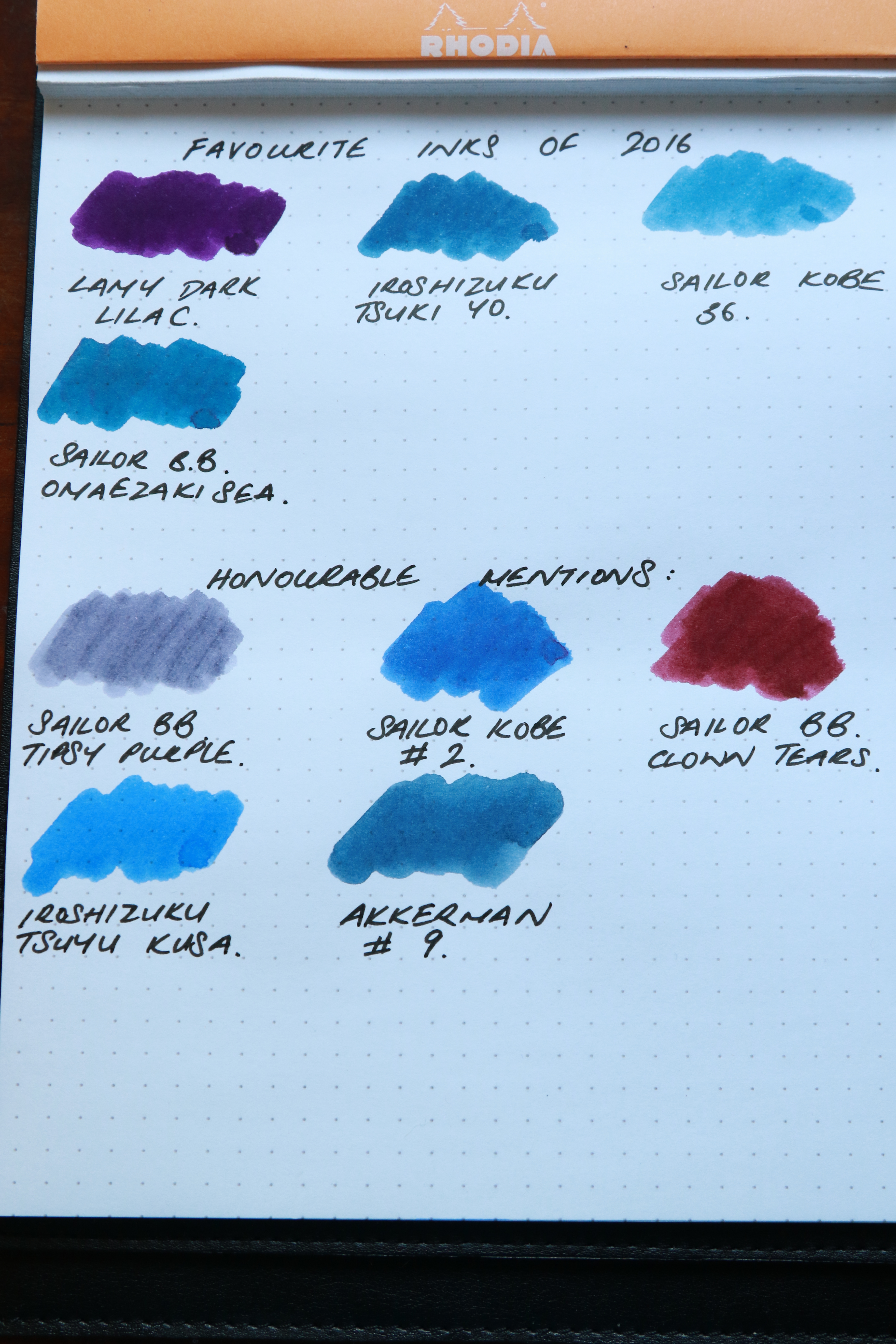
I bought quite a few inks in 2016 and I thought I would look back and think about my favourites in 2016.

In the past, I have tried to use my inks reasonably consistently throughout the year, but this year, I have definitely favoured a few above all others.

So in no particular order, here goes (the swabs don’t really do justice to the inks in real life):

Favourite inks 1.JPG

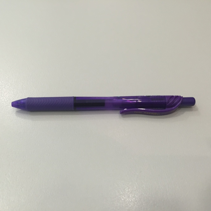
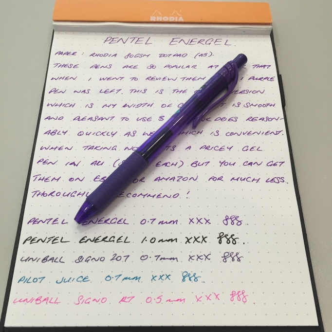
Pentel Energel-X BL107 0.7mm

Pentel Energel 1.JPG

The Pentel Energel is a fantastic gel based pen, which is apparently based on a low viscosity liquid gel ink. It means (according to Pentel) that the ink is smooth flowing and quick drying compared to other gel pens. This model has a nice rubbery grip section and unlike the Pilot Juice, it doesn’t leave pen ball “cleavage”.

pentel-energel-2

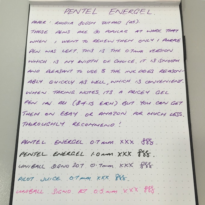
I ordered a bunch of these a little while back for the work stationery cupboard and by the time I got around to pilfering one for my own use (and to review) the only one left was a purple one. These are a big favourite at work and the coloured pens (particularly the light blue and the pink) really stand out.

They are a little expensive to purchase in Australia, but then most gel pens are ($43/dozen from Staples). However, they can be had cheaper on eBay and Amazon even after shipping, and they now have more economical models which can be had for nearly half the price as the model reviewed here ($26/dozen from Staples).

Pentel Energel 3.JPG

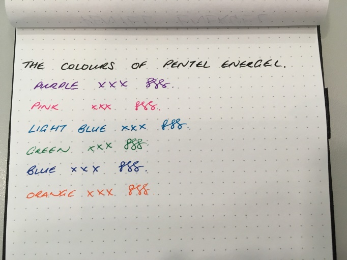
What I really like about them is the vibrancy of the colours of the pens. The colours are really bright and really fun to use. I managed to beg some colleagues around the office for the quick use of their Energels in different colours. They were quite protective and I had to promise to give them back. I think the Light Blue is my favourite.

Pentel Energel 4.jpg


I really enjoy these pens. They haven’t quite displaced Uniball signos for me, I think they have come pretty close.

Pelikan Edelstein Aquamarine

Pelikan Aquamarine 1.JPG

Pelikan Edelstein inks are the high end inks offered by Pelikan, based on gemstone colours (Edelstein means gemstone in German). Pelikan has been offering “Ink of the Year” limited edition inks since 2012 and this year is the turn of Aquamarine.

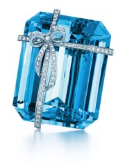
Let’s just stop and have a look at what an aquamarine looks like. This is from Tiffany and Co:

pelikan-aquamarine-2

Image from Tiffany and Co.

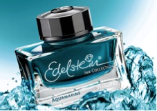
This is the promotional image from Pelikan:

Pelikan Aquamarine 3.jpg

Image from Pelikan.com

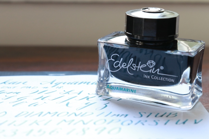
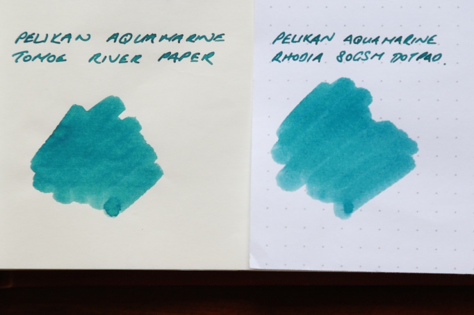
And this is what it looks like in real life:

Pelikan Aquamarine 4.JPG

I know the colour isn’t necessarily a direct representation of the gemstone, more likely just inspired by it, however readers of this blog will know my peeve about too-green inks that are meant to be turquoise or teal. I was really excited that this ink would be a more blue leaning turquoise colour – like the love child of Ku Jaku and Ama Iro (with mostly Ama Iro genes). On hindsight, perhaps that was unrealistic as it would then start invading the territory of Pelikan Edelstein Topaz and perhaps would not be unique enough for an Ink of the Year colour.

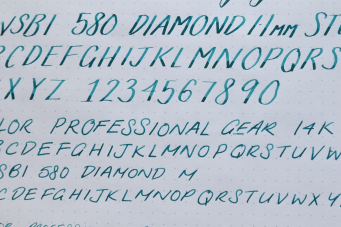
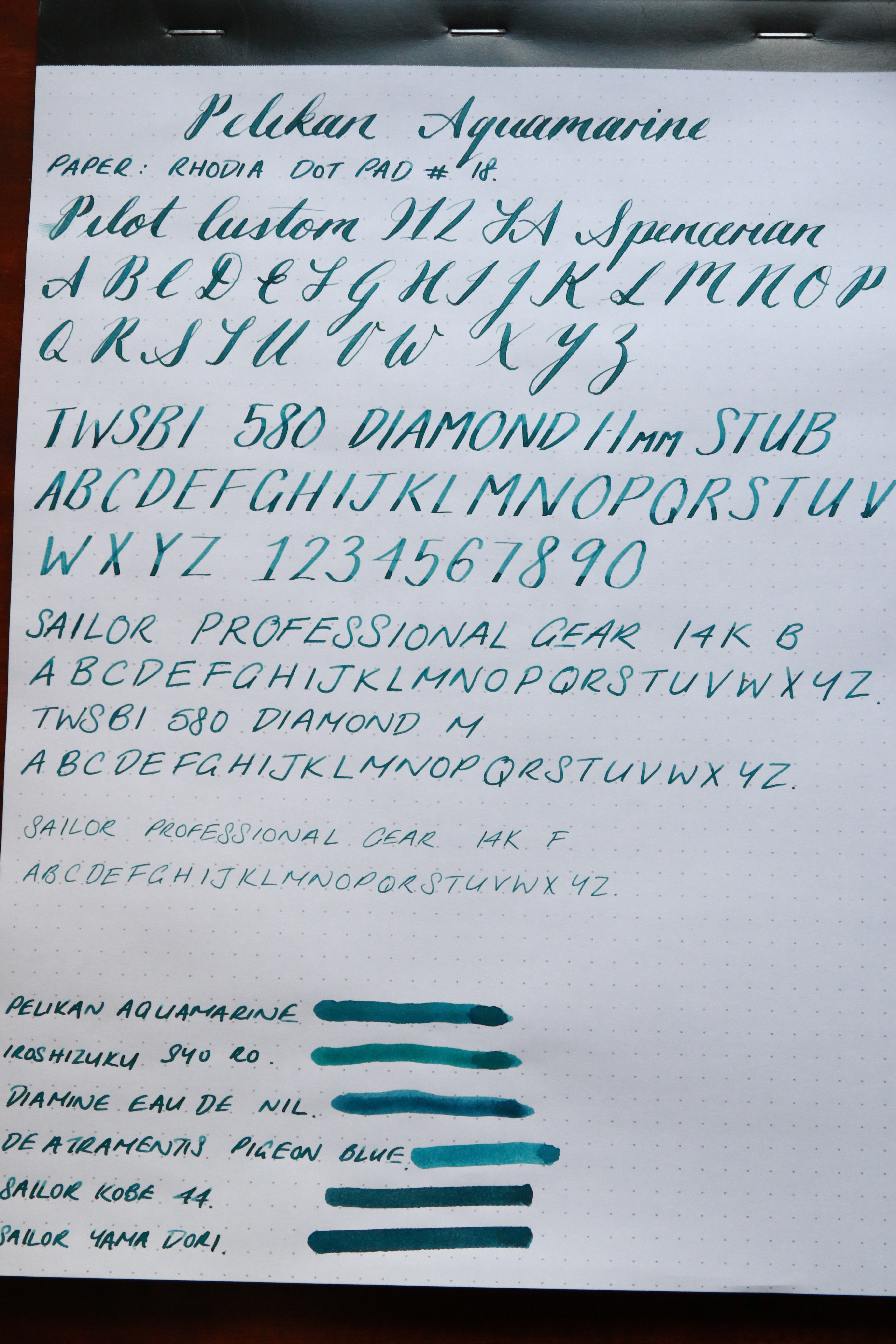
Colour whinging aside, this ink performs typically for a Pelikan Edelstein ink – that is well behaving – nice flow and quick drying in my experience. Even using it on Tomoe River Paper with the TWSBI 1.1mm nib, I didn’t notice any significantly long drying times. It flows well and didn’t even feel dry in the ultra fine Sailor 14K F.

The ink shows a good amount of shading, particularly in wider nibs, as you can see in the TWSBI 1.1 stub. The broad Sailor nib also shows a good amount of shading, but this is lost in wetter nibs, as shown in the Pilot spencerian nibs at the top.

Pelikan Aquamarine 5.JPG

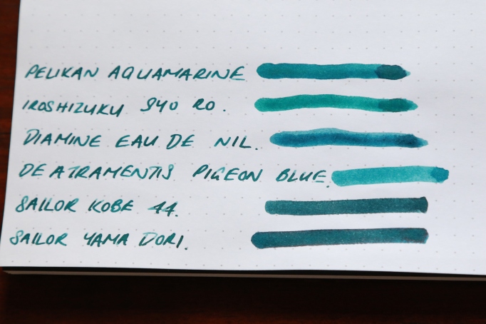
Mostly, this ink is compared to Diamine Eau di Nil, which looks like a marginally bluer version – albeit a lot more price effective. I think the Sailor Kobe Suma Ura Seaside Blue (#44) is a darker version of Aquamarine, but if you want an alternative to Aquamarine and you are considering Sailor Kobe #44 – just get Aquamarine. It is cheaper and easier to find (for now).

Pelikan Aquamarine 6.JPG

Overall, I really enjoy Pelikan Edelstein inks. They are on the pricier side of inks and retail in the US for USD$27.80, but you can get them cheaper if you look – I purchased mine for AUD$21 a bottle. If you do fancy it then you better pick a bottle up soon. They will discontinue production after 2016 is over!

Available in bottle and cartridge format.

Pelikan Aquamarine 7.JPG

To plan a planner

1.JPG

Warning – if you don’t like people being particular about small things etc, don’t read this. Just look at the pictures and wait for the next post or something.

Like all other stationery enthusiasts, at this time of the year its typical to reflect on what has worked and what has not worked with the planner used for the previous year and what are the options for planners in the upcoming calendar year.
2

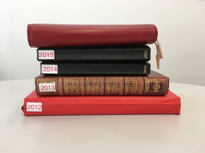
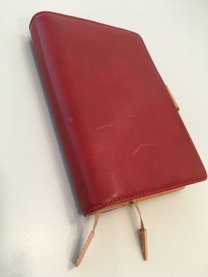
I have been using the Hobonichi planner for the last 3 years and I love that thing primarily for the paper that is in it – Tomoe River Paper, the paper love of my life. But since my first Hobonichi I have invested in an enormous stack of Tomoe River Paper which I use every day, so whilst having Tomoe River Paper in my planner is ideal, it is no longer essential.
3.JPG

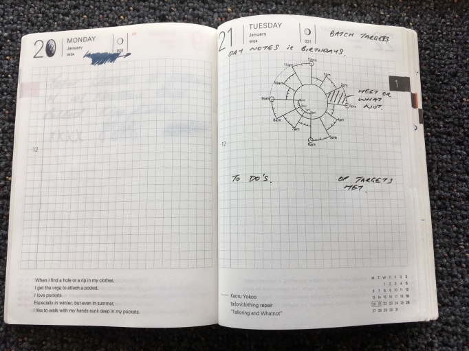
The other thing about the Hobonichi is that it is day to a page, which was previously essential in order to track daily operational targets, however, this has now be digitalised (the sacrilege!) by using Google sheets. The reason we have done this is so that other managers within the business can also understand how we are tracking on daily operational targets, not just me. So with this happening and a shift in workflow, where I track weekly targets as well as daily tasks, a week to an opening was much more preferable to the current day to a page layout.

Knowing that I was not going to be ordering a direct replacement Hobonichi, I decided to have a good think about what I wanted from a planner.

  • Good paper (Tomoe preferable but Rhodia is ok)
  • ~A5 size (definitely no bigger, but smaller is acceptable)
  • Week to an opening
  • Ability to track meetings chronologically – without it taking up too much room
  • Ability to have daily task planning space
  • Ability to have weekly to do planning space
  • Thin so I can tuck it into my daily notebook
4

Image from Hobonichiplanner.com

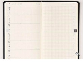
I first looked into the Hobonichi Techo weeks planner, which has a week to an opening layout and comes with Tomoe. It has narrower dimensions than A5, however, its not thin enough so that I can tuck it into my daily work notebook to carry around with me. The key thing though, was that I couldn’t organise meetings chronologically, as the daily space in which to write was too narrow. If I really wanted to do that I would need to somehow divide the space up based on time each day and I just knew I wouldn’t do that. So unfortunately, no more Hobonichi for me.
5

Hobonichi Tech Weeks layout

Image from Hobonichiplanner.com

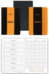
I then looked at the Rhodia weekly planner, but it came with the same issue as the Hobonichi Weeks which was too fat and not enough room each day.
6

Image from Rhodipads.com

I looked at the Traveler’s Notebook Weekly vertical planner, but hated that because it spread the whole day across the length of the page. I used a Quo Vadis Habana planner that was like that one time and absolutely hated it. Plus there was no space to list to do’s weekly or daily so that was out.
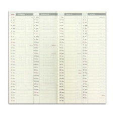
7.jpg

Image from The Journal Shop

Traveler’s Notebook Regular weekly planner

I’ve been using Patrick Ng’s Chronodex system in my Hobonichi’s for the past few years. I don’t use it for what a lot of his fans use it for (which is to view appointments and meetings visually based on time clocks etc), I use it simply for the fact that it allows me to organise my day in a small space. In my Hobonichi I actually stamped a chronodex onto each page to use in organising my day. So I looked into stamping a chronodex onto sheets of Tomoe river paper for use each week. OMG – that was a lot of work – which you would say, isn’t it the same amount of work doing that day to a page compared with week to an opening and the answer is yes, however, the key thing to note is that on day to a page if you stamp it wonky, in one or two days you can flip the page and forget about it. On week to an opening, first its more noticeable because the chronodexes are all out of alignment and secondly, you have to put up with it for a week! I am far too OCD to be able to work under those conditions.

I looked at Patrick Ng’s 2 chronodex options – both are formatted for the regular size Traveler’s notebook. His “original” planner had no room for daily/weekly tasks and the Michael Jecks version looked perfect, except when you printed it out the chronodexes were too small.
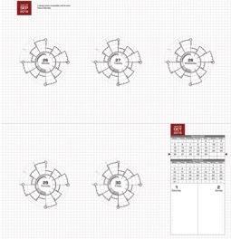
8

“original’ Chronodex planner

Image from Scription.typepad.com
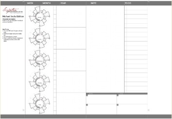
9

“Michael Jeck’s” Chronodex planner

Image from Scription.typepad.com

So I looked into designing my own based on the Chronodex. I know that there are services available online for you to design your own and get it printed, but I wanted a trial run to see if I would like using week to an opening, before I committed for a full year. Also, most of those options tend to give you thick planners. I looked at getting the chronodexes printed on Tomoe but looking at the Penhabit’s notes on printing Tomoe River Paper, it looks like the paper quality and performance deteriorates when printed and so then it would be a disappointment and a waste. In the end, I ended up using Rhodia because I had 3 A4 pads lying around doing nothing, so it was a good use of currently available resources. This is what I ended up with:
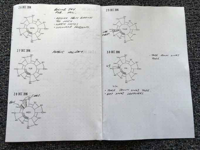
10.JPG

Small daily tasks go on the right of each chronodex and bigger weekly tasks go under “To Do”. I need to manually stamp the dates on but because the paper is dot grid, I can do that neatly without triggering my OCD. I am still trialling this version and will need to print it all out and staple them together, but I have used the trial version for about 3 weeks now and so far to good.
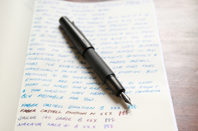
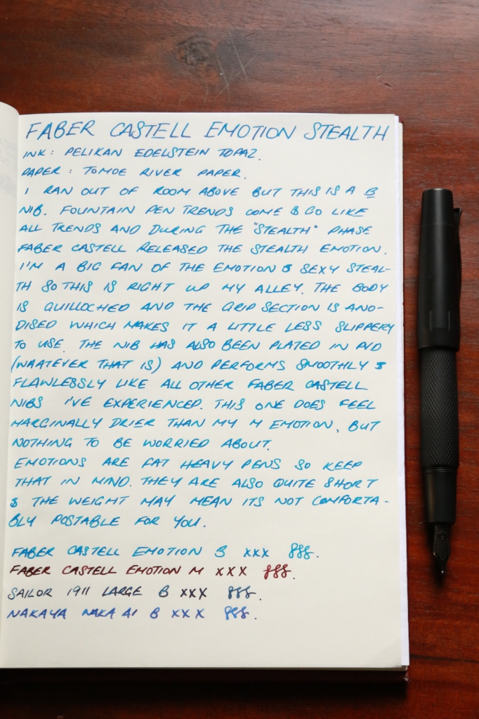
Faber Castell E-motion Stealth

Faber Castell Emotion Stealth 1.JPG

Faber Castell pens don’t seem to get as much love and attention as some other cult favourites like Pilot, Edison or Franklin Christoph, which is surprising given their exceptional nib performance and their varying price range. (As a disclaimer, if you can’t already tell, I am rather fond of Faber Castell.) Perhaps its because their designs are a bit different or because their pens are more metal/wood based and thus heavier than plastic/acrylic that is currently in vogue.

My first experience with a Faber Castell was a pear wood e-motion with a medium nib. I enjoyed that pen so much that when the Stealth version came out in 2014 (?) I bought that as well, with a broad nib.

Faber Castell Emotion Stealth 2.JPG

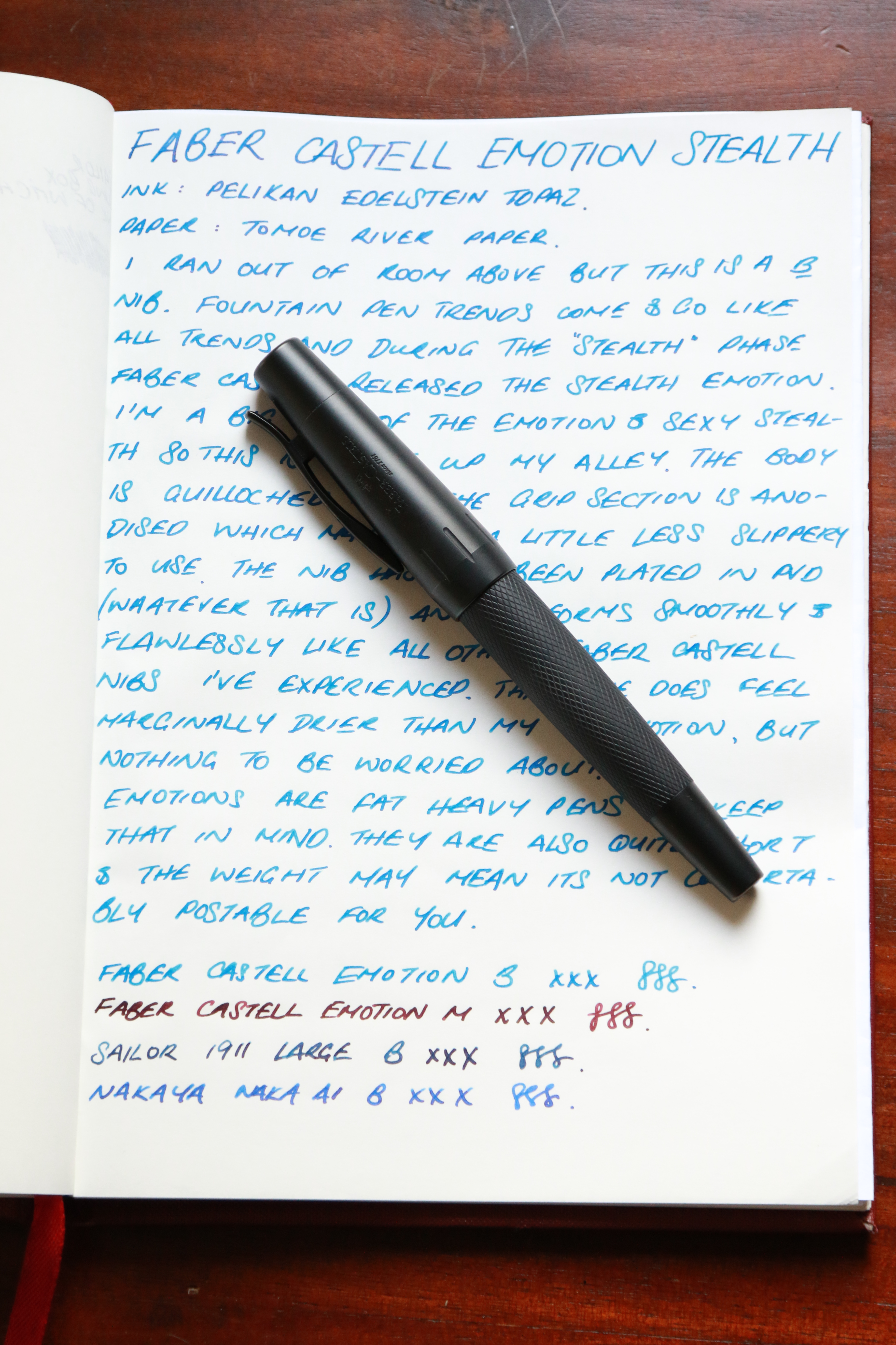
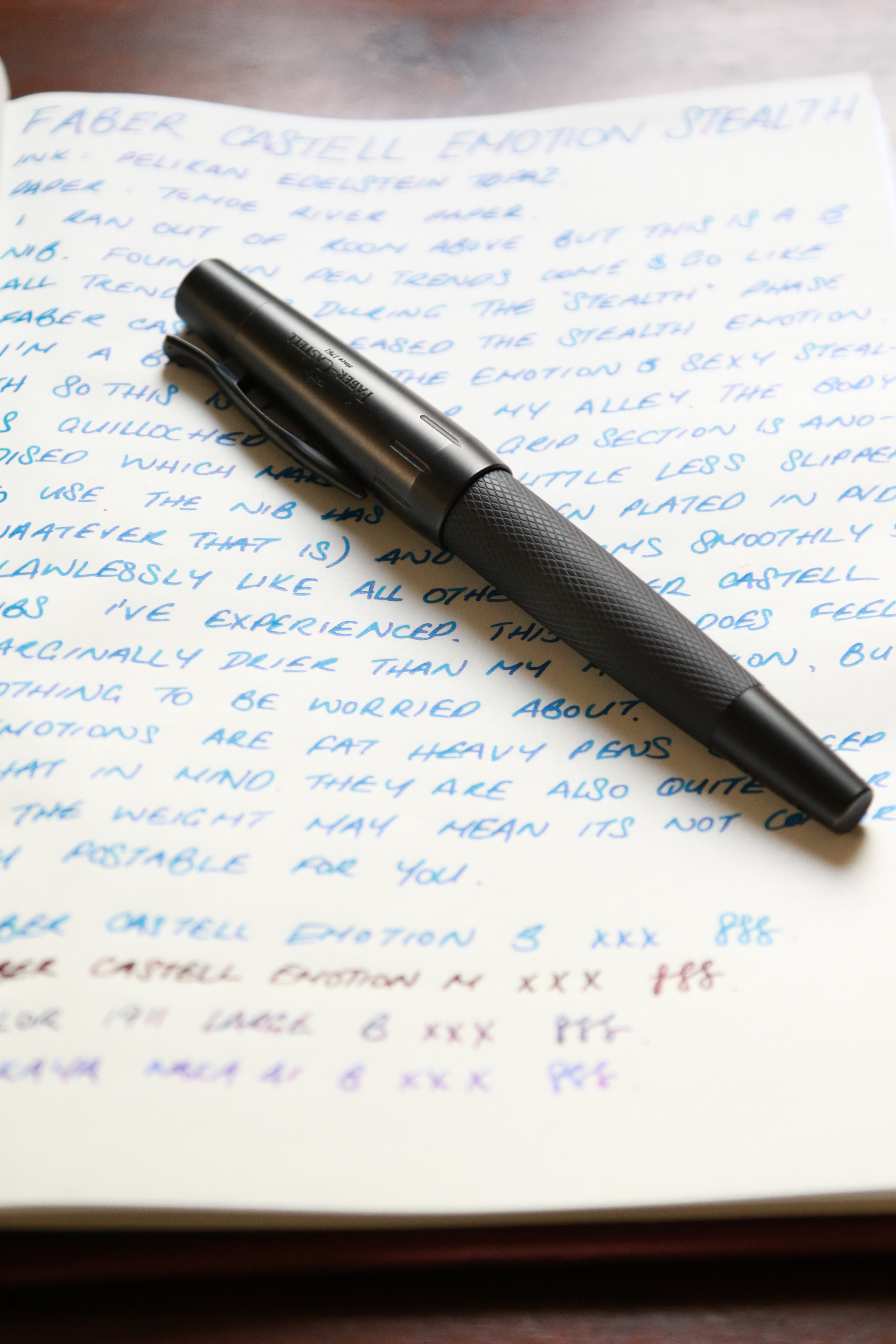
The Stealth version of the e-motion has been coated and the finish is matte black and smooth, it reminds me of the finish on the Sailor Imperial Black if you are familiar with that pen. The finish is smooth and can end up providing you with more grip or end up being more slippery if you have super dry skin on your hands. It sounds stupid, but if you have had experience with Nakaya Matte Black Hairline Finish, Lamy 2000 Makrolon, or the Sailor Imperial Black as mentioned above, you will know what I mean. For me, the fact that the pen is fat and heavy helps, because it just sits nicely in my hand and I don’t have as much of a tendency to roll it as I do with the Lamy 2000.

Its worth noting that the E-motion is a short, fat, heavy pen – if you typically need to post your pens, or you have big hands you may want to give this a skip. The cap on its own is very heavy and posting makes it extremely top heavy. I’m not sure that it’s really a practical option. Faber Castell pens always seem to have a very functional clip and this is no exception, the clip is very sturdy on the pen – spring loaded for your convenience.

faber-castell-emotion-stealth-3

The nib is also coated black for this edition and unlike the Sailor nibs, there is no disclaimer to use only Faber Castell branded nibs to not void warranty. I’ve had mine for about a year and there has been no problems with the coating flaking or discolouring like some of the Sailor black coated nib complaints that are out there. I’ve used Sailor, Noodlers, Diamine, Pelikan and Iroshizuku inks in this pen and have had no issues so far. The nib comes in XF, F, M and B and you can buy replacement fountain pen nibs, but not in the black coated version.

The nib is a dream to use, smooth but with a little hint of feedback that makes that nice “singing” noise like Nakaya and Franklin Christoph nibs. I found this nib to be a bit drier than my medium e-motion nib, but only marginally so and with wetter inks like Iroshizuku, there was no difference in performance. The pen also comes standard with a Faber Castell converter, which I think is standard international size, and it is a nice sturdy well performing converter. The good thing with it being standard international size means that you can use an ear bulb syringe to clean it out after use as well, which makes it easy to clean.

I purchased mine from Cult Pens in the UK, and the stealth version is ~37.66 pounds (AUD$64 ish) more expensive than the non-stealth versions. You will need to decide whether the finish is worth the mark up. The finish aside, I definitely recommend the E-motion in any iteration that you prefer.

faber-castell-emotion-stealth-4